Venetian Booking Engine
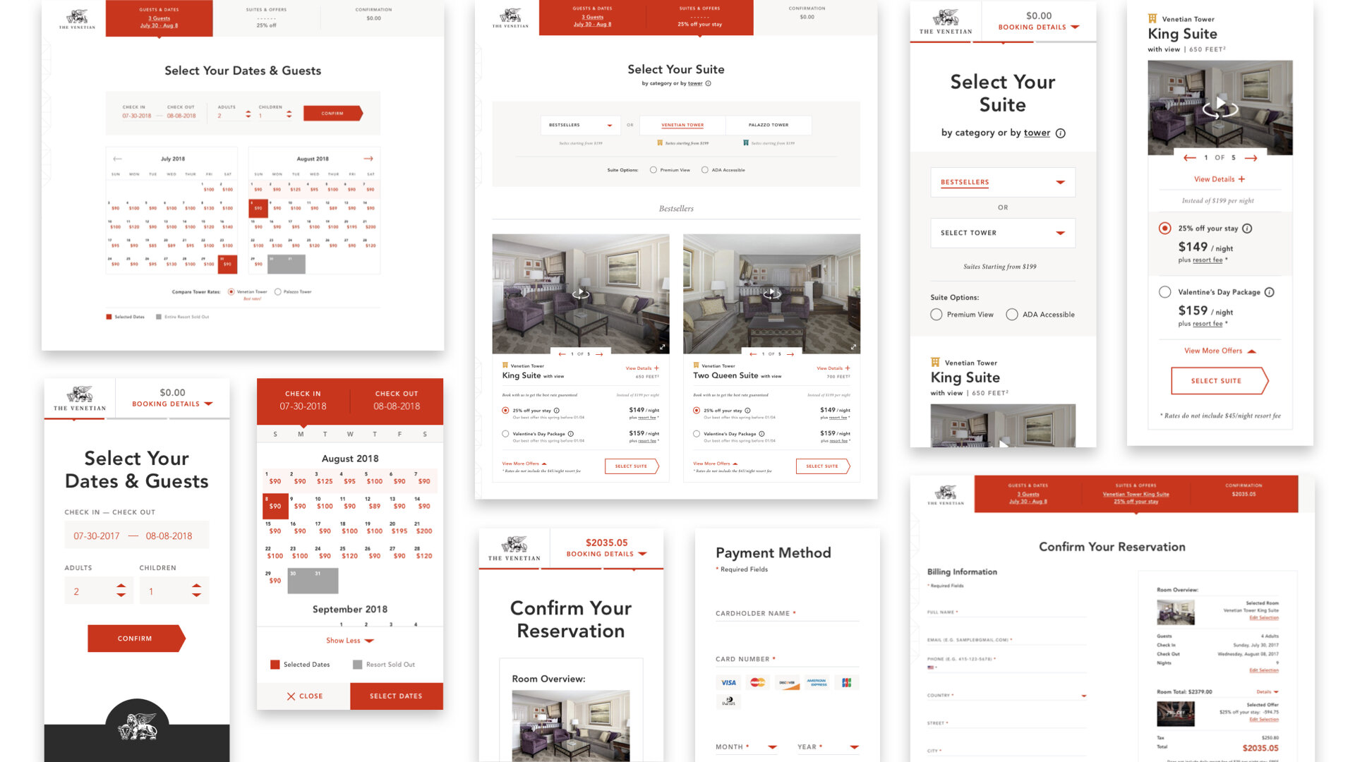
Tasked with a best in class 100 million dollar + booking engine experience, the team created a single page application layered on top of their existing booking API for a seamless experience that feels more app than website. Due to the business sensitivity of this project, the application had to go through numerous rounds of design and testing iterations spanning over a year and a half. To this day we’re continuously making updates to the application based on data & analytics, user feedback and evolving business requirements.

Project Scope
Role: Associate UX Director
Define
Due to the high stakes nature of the project we went through a very thorough define phase. We analyzed all existing performance data of the present booking engine with a complete UX audit before outlining user flows and tasks needed to support the very specific business requirements.
Research & Data Analysis | User Flows & Task Analysis | UX Audit | Concept Designs
Design
The design phase spanned over a full year of iterating between wireframes, designs, and prototypes, while user testing throughout leaving nothing to chance. From an initial 4 step flow we were able to design and test it down to a 3 step process while balancing a frictionless booking funnel with their upselling business requirements.
Wireframes | Prototyping | Testing | Interaction Design
Development
Working very closely throughout the design phase with both internal and external technology teams, we organically transitioned into development while continuing to making updates and improvements as we progressed. Detailed design annotations and functional specifications were created to document every part of the experience for posterity.
Functional Specs (Confluence) | UX & Design Q&A
Product Features
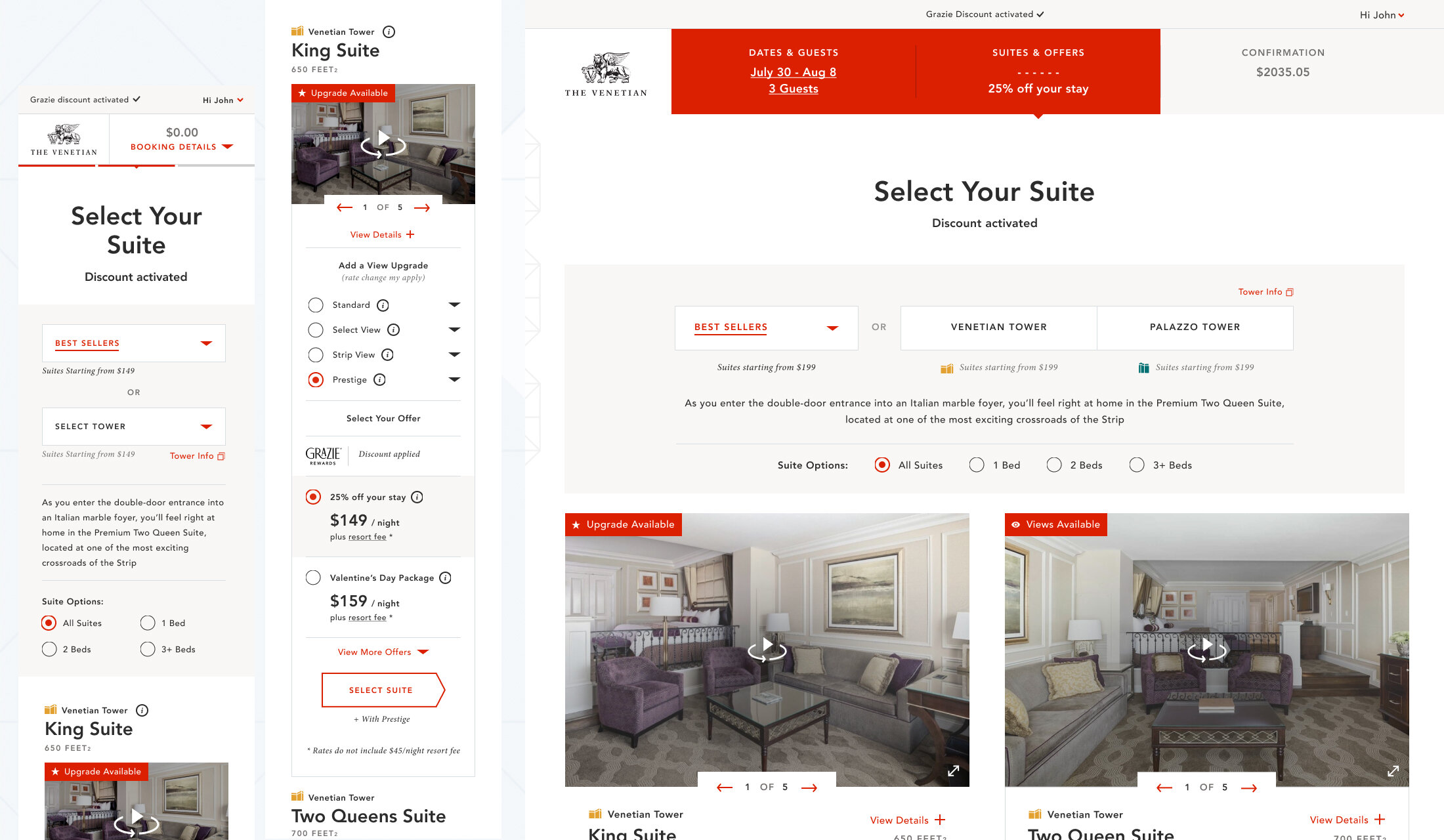
Creating a frictionless booking experience while enabling users to explore, change and upgrade their rooms with a variety of offer and promotion combinations presented the biggest challenge of the project. The use of progressive disclosure throughout allowed us to provide detailed information where needed while keeping the overall experience uncluttered while pushing users through the funnel. Providing a sense of progression and position via the progress tracker was key to allow users to jump back and forth between steps effortlessly while maintaining forward progress. An intricate messaging system made users aware of next steps and how any changes would affect previously selected choices. An integrated rate calendar displays current and future rates up to 12 months in advance, while showing availability and blackout dates in combination with any selected offers by the user.
For more information and a detailed walkthrough of the process and full features set,


